The concept of a mastermind
A mastermind is a monthly meeting where members openly discuss, give and take feedback on their personal issues, aspirations, successes, failures and anything else related to their personal development.
Amstermind is an online community created by 5 friends from Amsterdam with the intention of a) spreading the idea and value of participating in a mastermind group, b) creating a community of people interested in their self development and c) creating high quality personal development material for those people.
The branding of Amstermind was created out of the need for an image that would communicate a sober and yet powerful idea free of superfluous elements and distractions.
The logo
The logo of Amstermind was created to communicate the core values of the group in an elegant yet strong manner.

The upwards pointing triangle represents elevation, a movement upwards, what self development is all about. It also hints at the shape of the A from the name Amstermind. It is bold and vibrant just like the personalities of the group.
The hexagon represents the idea that life is multifaceted. The Amstermind blog explores different categories of life which all together make a solid entity. And that's the shape of the 3D cube that can be seen arising from silhouette of the hexagon.
Lastly, the shadow of the triangle makes it look like it has volume underneath, like it's a solid object seen from the top and not just a flat surface, which along with the hidden 3D cube represent the fact that things in life are much deeper that they appear and Amstermind people are exploring those depths in their articles.
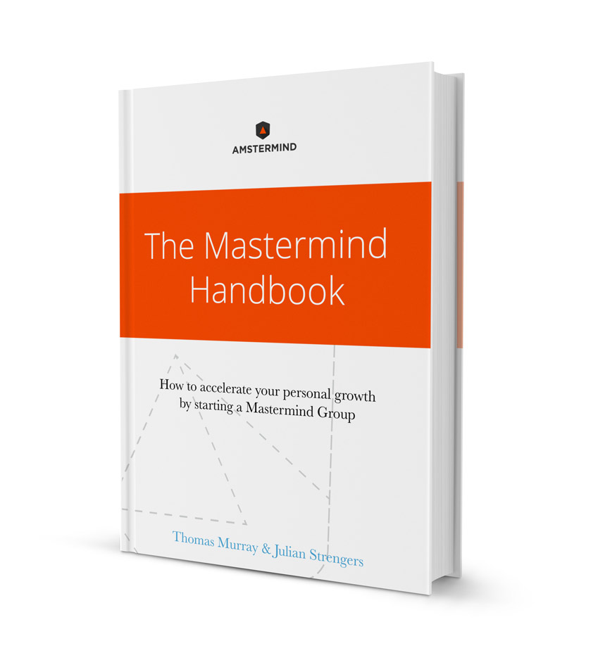
The book
One of Amstermind's flagship products is the e-book “The Mastermind Handbook”. It’s a comprehensive guide to starting your own mastermind group. The book was designed in a way that is easy to read and easy to scan for the information you need.
Although it's actual form is digital we created a number of print representations of the book for promoting purposes.
The website
Amstermind is an online community and since it's on its infancy we designed a website that would help promote the most valuable material it has to offer in a way that is also easy to absorb.
The goal of the design in this case is to be unobtrusive. The most important things are communicated through the quality of the website's content so our main priority was to make the content as accessible as possible.
For this reason the navigation elements are kept to a minimum through the use of a hamburger menu and simple buttons for navigating through the pages.
The main articles are presented with big clear typography and short description in a minimal one column layout.


